YUTH - RainbowVI
Redesigned RainbowVI's MVP web app, focusing on enhancing usability, accessibility, and overall user experience.
Type
Web App | Internship
Role
UX/UI Designer, Frontend Developer
Tools
Figma, Illustrator, React.js
Duration
April 2025 - May 2025 (2 Months)
YUTH is an initiative by RainbowVI, a nonprofit offering free online learning resources focused on life skills, mental health, and well-being. RainbowVI's mission is to help young adults grow into confident, capable changemakers by offering guidance, educational content, and opportunities for personal and community development.
The initial MVP of YUTH was developed by a small group of volunteers, including BCIT development students and organization members. However, this MVP was inconsistent, outdated, and lacked strong usability and accessibility.

How can we redesign key user flows to simplify navigation, enhance accessibility, and increase engagement for young adults?
What Gets in the Way of Young Adults Engaging With Online Content?
To align with our target audience and make informed redesign decisions, we first needed to understand the challenges, motivations, and behaviours of young adults engaging with online content.
We started by analyzing existing user research and data provided by RainbowVI. To supplement this, we conducted desk research on UX patterns for teenagers and a competitive analysis of informational and mental health apps to identify common UX/UI patterns.
The following key patterns were identified:
- Teenage users have low patience thresholds and prefer professional, polished, and personalized experiences, especially on mobile.
- Bite-sized content with visual/audio variety and features drives consistent engagement.
- Fast disengagement happens with overwhelming designs and forced social engagement.
- Flexibility, instant feedback, visible progress, and clear benefits reinforce positive feedback and continued use.
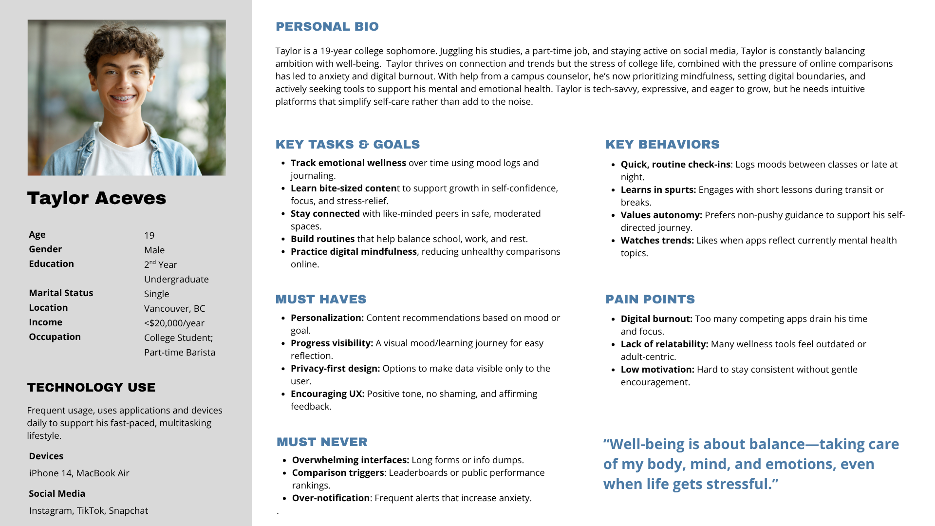
These insights helped revise the existing persona and define the direction for the redesign.

Defining the Solution and Scope
To validate the findings, assess usability and understand user perceptions of the current MVP, we conducted two parallel versions of a usability test (In-Person and Take-Home) with 11 young adult participants (ages 15-29).
Using task-based observation and follow-up surveys, we identified points of confusion, elements that worked well, and areas where users dropped off. Then, the findings were clustered to prioritize and address the top three issues.
The following top three issues were identified:
- Lack of mood entry editing capabilities
- Confusing or hidden navigation and CTA's
- Visual design inconsistencies and UI clarity
The user flow was revised based on the findings and aligned with the new design direction. This helps users, designers, and developers organize the app's content and ensure smooth navigation by clearly outlining how paths connect and end.

Early Concepts and Iterations
To iterate on the findings, we explored different creative design directions and developed a new style guide along with some fun ideas. After discussing and voting with the supervisor, the following was chosen.

To address the top issues and pain points, we simplified mood logging while keeping the educational focus, updated course layouts, added video content, and redesigned the home and journal pages for clearer guidance and easier navigation.
A lo-fi prototype was then created and reviewed in a design critique session with a lead product designer. This session reinforced key design decisions, highlighted areas for improvement, and helped strengthen overall consistency.

Final Product and Deployment
The top wireframes were converted into hi-fi prototypes, following the updated style guide and design guidelines. The process focused on refining micro-interactions, auditing accessibility and keyboard navigation, and ensuring a unified overall design. After finalizing the design, it was developed using React with a mobile-first approach.

Key Challenges
In a remote setting, inconsistent team communication sometimes slowed progress and resulted in uneven workload distribution. This highlights the importance of adaptability, adjusting to different team dynamics, and setting clear boundaries.
Conclusion
The supervisor appreciated the work and confirmed that all project goals were successfully met within the two-month internship period.
Reflecting on my internship experience, I gained valuable insight into the nonprofit sector and hands-on experience with various types of user research, design styles, and implementation. I also learned how to collaborate effectively in a remote environment and manage team challenges. Finally, it was rewarding to see my contributions help bring the organization's vision to life while reinforcing the skills I developed in BCIT's Digital Design and Development program.